

Build a Blazor 'Copy to Clipboard' component with a Markdown editor
Let's build a 'Copy to Clipboard' component, where we can copy Markdown content to the clipboard.
I recently built a quick utility app for the day job, where I used a simple Markdown previewer with a Copy to Clipboard button. I use the button to notify if the copy is successful. Then, I return the button to its original state.
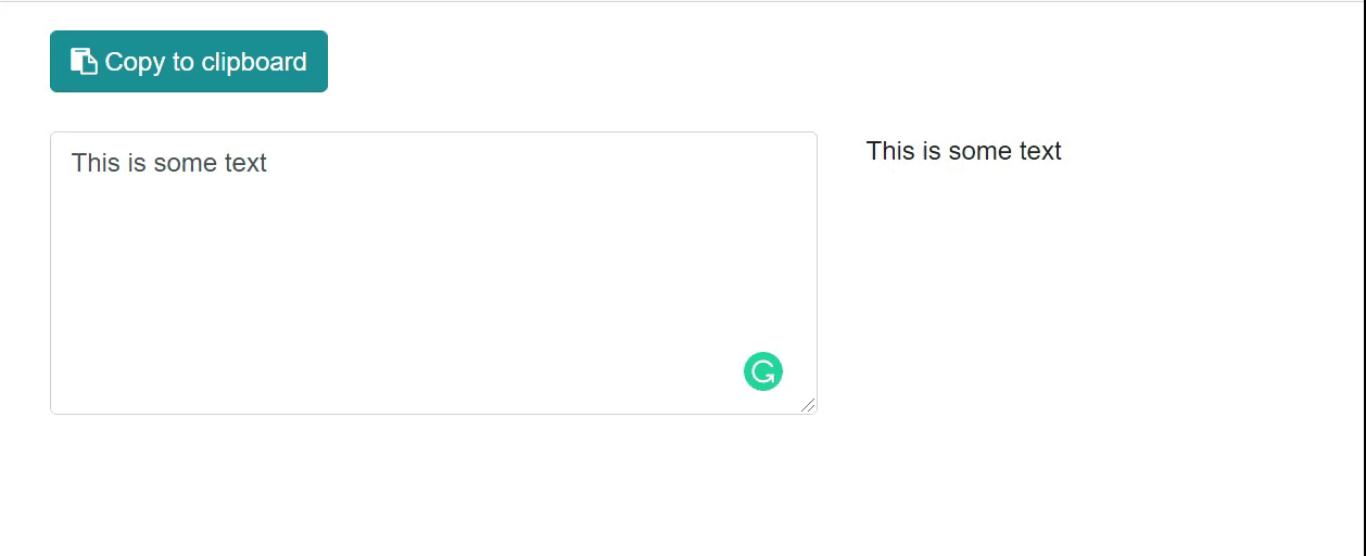
Here’s how the app looks when it works correctly.
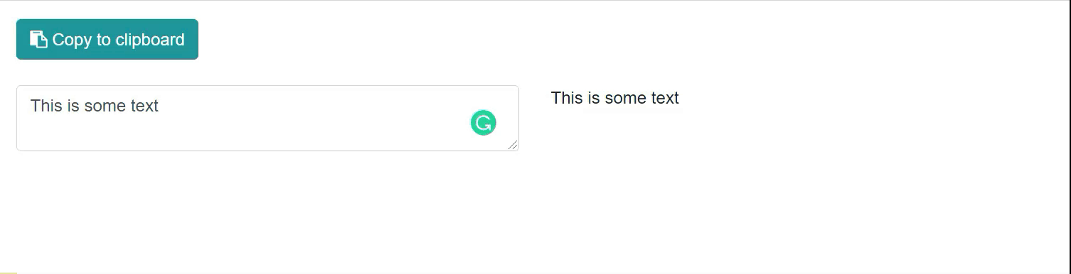
And here’s how it looks when the copy fails.
We’ll build a component that allows users to copy and paste text from a markdown previewer. This process involves three steps:
- Implement a
ClipboardService - Create a shared
CopyToClipboardButtoncomponent - Use the component with a markdown previewer
The code is out on GitHub if you’d like to play along.
Implement a ClipboardService
To write text to the clipboard, we’ll need to use a browser API. This work involves some quick JavaScript, whether from a pre-built component or some JavaScript interoperability. Luckily for us, we can create a basic ClipboardService that allows us to use IJsRuntime to call the Clipboard API, which is widely used in today’s browsers.
We’ll create a WriteTextAsync method that takes in the text to copy. Then, we’ll write the text to the API with a navigator.clipboard.writeText call. Here’s the code for Services/ClipboardService.cs:
using System.Threading.Tasks;
using Microsoft.JSInterop;

namespace ClipboardSample.Services
{
    public class ClipboardService
    {
        private readonly IJSRuntime _jsRuntime;

        public ClipboardService(IJSRuntime jsRuntime)
        {
            _jsRuntime = jsRuntime;
        }

        public ValueTask WriteTextAsync(string text)
        {
            return _jsRuntime.InvokeVoidAsync("navigator.clipboard.writeText", text);
        }
    }
}
Then, in Program.cs, reference the new service we created:
builder.Services.AddScoped<Services.ClipboardService>();
With that out of the way, let’s create the CopyToClipboardButton component.
Create a shared CopyToClipboardButton component
To create a shared component, create a CopyToClipboardButton component in your project’s shared directory.
Thanks to Gérald Barré for his excellent input on working with button state. Check out his site for great ASP.NET Core and Blazor content.
At the top of the file, let’s inject our ClipboardService. (We won’t need a @page directive since this will be a shared component and not a routable page.)
@inject ClipboardService ClipboardService
Now, we’ll need to understand how the button will look. For both the active and notification states, we need to have the following:
- Message to display
- Font Awesome icon to display
- Bootstrap button class
With that in mind, let’s define all those at the beginning of the component’s @code block. (This could be in a separate file, too, if you wish.)
@code {
    private const string _successButtonClass = "btn btn-success";
    private const string _infoButtonClass = "btn btn-info";
    private const string _errorButtonClass = "btn btn-danger";

    private const string _copyToClipboardText = "Copy to clipboard";
    private const string _copiedToClipboardText = "Copied to clipboard!";
    private const string _errorText = "Oops. Try again.";

    private const string _fontAwesomeCopyClass = "fa fa-clipboard";
    private const string _fontAwesomeCopiedClass = "fa fa-check";
    private const string _fontAwesomeErrorClass = "fa fa-exclamation-circle";
With that, we need to include a Text property as a component parameter. The caller will provide this to us, so we know what to copy.
[Parameter]
public string Text { get; set; }
Through the joy of C# 9 records and target typing, we can create an immutable object to work with the initial state.
record ButtonData(bool IsDisabled, string ButtonText,
        string ButtonClass, string FontAwesomeClass);

ButtonData buttonData = new(false, _copyToClipboardText,
                      _infoButtonClass, _fontAwesomeCopyClass);
Now, in the markup, we can add a new button with the properties we defined.
<button class="@buttonData.ButtonClass" disabled="@buttonData.IsDisabled"
        @onclick="CopyToClipboard">
    <i class="@buttonData.FontAwesomeClass"></i> @buttonData.ButtonText
</button>
You’ll get an error because your editor doesn’t know about the CopyToClipboard method. Let’s create it.
First, set up an originalData variable that holds the original state, so we have it when it changes.
var originalData = buttonData;
Now, we’ll do the following in a try/catch block:
- Write the text to the clipboard
- Update
buttonDatato show it was a success/failure - Call
StateHasChanged - Wait 1500 milliseconds
- Return
buttonDatato its original state
We need to explicitly call StateHasChanged to notify the component it needs to re-render because the state … has changed.
Here’s the full CopyToClipboard method (along with a TriggerButtonState private method for reusability).
public async Task CopyToClipboard()
{
    var originalData = buttonData;
    try
    {
        await ClipboardService.WriteTextAsync(Text);

        buttonData = new ButtonData(true, _copiedToClipboardText,
                                    _successButtonClass, _fontAwesomeCopiedClass);
        await TriggerButtonState();
        buttonData = originalData;
    }
    catch
    {
        buttonData = new ButtonData(true, _errorText,
                                    _errorButtonClass, _fontAwesomeErrorClass);
        await TriggerButtonState();
        buttonData = originalData;
    }
}

private async Task TriggerButtonState()
{
    StateHasChanged();
    await Task.Delay(TimeSpan.FromMilliseconds(1500));
}
For reference, here’s the entire CopyToClipboardButton component:
@inject ClipboardService ClipboardService

<button class="@buttonData.ButtonClass" disabled="@buttonData.IsDisabled"
        @onclick="CopyToClipboard">
    <i class="@buttonData.FontAwesomeClass"></i> @buttonData.ButtonText
</button>
<br/><br />

@code {
    private const string _successButtonClass = "btn btn-success";
    private const string _infoButtonClass = "btn btn-info";
    private const string _errorButtonClass = "btn btn-danger";

    private const string _copyToClipboardText = "Copy to clipboard";
    private const string _copiedToClipboardText = "Copied to clipboard!";
    private const string _errorText = "Oops. Try again.";

    private const string _fontAwesomeCopyClass = "fa fa-clipboard";
    private const string _fontAwesomeCopiedClass = "fa fa-check";
    private const string _fontAwesomeErrorClass = "fa fa-exclamation-circle";

    [Parameter]
    public string Text { get; set; }

    record ButtonData(bool IsDisabled, string ButtonText,
        string ButtonClass, string FontAwesomeClass);

    ButtonData buttonData = new(false, _copyToClipboardText,
                      _infoButtonClass, _fontAwesomeCopyClass);

    public async Task CopyToClipboard()
    {
        var originalData = buttonData;
        try
        {
            await ClipboardService.WriteTextAsync(Text);

            buttonData = new ButtonData(true, _copiedToClipboardText,
                                    _successButtonClass, _fontAwesomeCopiedClass);
            await TriggerButtonState();
            buttonData = originalData;
        }
        catch
        {
            buttonData = new ButtonData(true, _errorText,
                                    _errorButtonClass, _fontAwesomeErrorClass);
            await TriggerButtonState();
            buttonData = originalData;
        }
    }

    private async Task TriggerButtonState()
    {
        StateHasChanged();
        await Task.Delay(TimeSpan.FromMilliseconds(1500));
    }
}
Great! You should now be able to see the button in action. If you need help triggering a failed state, you can go back to ClipboardService and spell the JS function wrong:
return _jsRuntime.InvokeVoidAsync("navigatoooooor.clipboard.writeText", text);
That’s great, but our component doesn’t do anything meaningful. To do that, we can attach it to a Markdown previewer.
Use the component with a markdown previewer
We can now build a simple markdown previewer with the Markdig library. This allows us to convert markdown to HTML to see the final state of our rendered Markdown state.
Thanks to Jon Hilton’s excellent post, I was able to do this in minutes. I’ll quickly add the component here—if you want greater explanation or context, please visit Jon’s post (another great site for Blazor content).
After you download the Markdig package and add a @using Markdig line to your _Imports.razor, create an Editor.razor component with something like this:
@page "/clipboard"

<div class="row">
    <div class="col-6" height="100">
        <textarea class="form-control"
        @bind-value="Body"
        @bind-value:event="oninput"></textarea>
    </div>
    <div class="col-6">
        @((MarkupString) Preview)
    </div>
</div>

@code {
    public string Body { get; set; } = string.Empty;
    public string Preview => Markdown.ToHtml(Body);
}
Long story short, I’m adding a text-area for writing Markdown, binding to the Body text. Then as a user types (the event="oninput), use Markdig to render HTML in the other pane on the right.
All we need to do now is include our new component, and pass the Body along. Add the following just below the @page directive and before the div:
<CopyToClipboardButton
    Text="@Body" />
As a reference, here’s the full Editor.razor file:
@page "/editor"

<CopyToClipboardButton
    Text="@Body" />

<div class="row">
    <div class="col-6" height="100">
        <textarea class="form-control"
        @bind-value="Body"
        @bind-value:event="oninput"></textarea>
    </div>
    <div class="col-6">
        @((MarkupString) Preview)
    </div>
</div>

@code {
    public string Body { get; set; } = string.Empty;
    public string Preview => Markdown.ToHtml(Body);
}
That’s really all there is to it!
Wrap up
In this post, we built a reusable component to copy text to the clipboard. As a bonus, the component toggles between active and notification states. We also saw how simple it was to attach it to a Markdown previewer.
There’s more we could do: for example, can we make the component more reusable by passing in button text and states—making it a ButtonToggleState component and not just used for copying to a clipboard? Give it a shot and let me know how it goes!